In data visualization, charts play an important role in simplifying complex data sets into readable and understandable formats. With a variety of different types of charts available, each serves a unique purpose in representing data. It becomes essential to choose the right type of chart suitable for your data. In this article, we focus on one such unique chart known as the bubble chart.
Understanding Bubble Charts: An Overview

Alt text: Two businesswomen going over data to include on a bubble chart
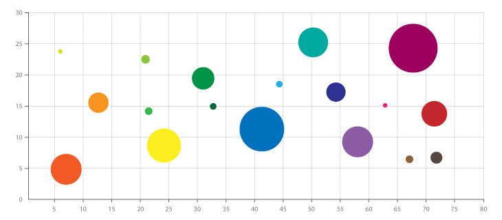
Bubble charts are a variant of the scatter plot, a graphical representation that uses Cartesian coordinates to display values for typically two variables for a set of data. However, while scatter plots use dots to represent data points, bubble charts use circles or “bubbles.”
The unique aspect of a bubble chart is its ability to visualize three dimensions of data. The X and Y coordinates represent two dimensions, while the size of the bubble represents the third dimension. Therefore, it provides insights into the relationship between these three variables.
The bubble chart can be particularly useful in identifying relationships, trends, or patterns in a large amount of complex data. These could include population dynamics in demographics, economic indicators, or performance analysis in various business scenarios.
Despite their complex nature, the goal of bubble charts is fairly simple—to present multiple layers of data in an effective and easily interpretable manner.
Origins of Bubble Charts: Where Did the Name Come From?
The term “bubble chart” may sound playful, but the name has a rather literal origin. In these charts, data points are represented by circles or “bubbles” whose size corresponds to the value of the third variable.
The accurate history of the bubble chart’s origin is unclear. However, it is believed that they became popularized during the 20th century, with advancements in the field of data visualization and the need to depict more complex data.
The name “bubble chart” was presumably adopted to embody the characteristic feature of the circles that appear like bubbles floating across the chart. Hence, the chart displays not just the correlation but also the distribution, giving a detailed picture of the data across three dimensions.
Interestingly, despite the “floating” implication of its name, a bubble chart provides a grounded perspective of complex data.
Exploring the Significance of a Bubble in Bubble Charts
The term “bubble” in a bubble chart holds much significance. The primary function that the bubble serves is to represent the third variable in the data. This inclusion of a third dimension differentiates bubble charts from their simpler cousin, the scatter plot.
The bubble in the bubble chart is not just another graphical representation but a tool of analysis. The size of the bubble brings the third dimension to the data, allowing for a richer, more nuanced understanding.
However, the size of the bubble can also be a source of confusion if not traced correctly to its corresponding value. Therefore, proper scaling and understanding of the data are crucial when creating a bubble chart.
Key Elements of Bubble Charts: Why They Matter

Alt text: Business professional using laptop to create a bubble chart
The key components of a bubble chart include the X and Y axes, and the bubbles themselves representing data points from three variables. These elements make this chart an excellent tool for presenting complex data.
The X and Y axes serve their traditional function of defining the two variables that we wish to correlate or compare. At a glance, these two dimensions identify the positioning of the bubbles within the plot.
With their unique ability to present multiple layers of data, bubble charts provide an effective tool in the hands of data analysts and business decision-makers.
Overall, understanding the origins and components of bubble charts not only illuminates their unique role in data visualization but also highlights how to use them effectively in various analytical scenarios.