In the world we live in, data is the new oil. Whether we are aware or not, we generate data every second of every minute, and every hour of every day. This colossal amount of data, when harnessed properly, is an asset that can propound valuable insights. Here, we delve into what is a pie chart in data analysis. Keep reading.
Digging Deeper Into Pie Charts: A Comprehensive Overview

Alt Text: A gif of a pie chart.
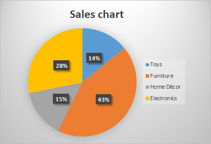
Pie charts are circular charts divided into sectors. Each sector represents a proportion of the whole, thus providing a visual representation of numerical data.
They are widely used in data analysis due to their simplistic design and high readability. After all, it’s easier to comprehend data when it’s presented in a colorful, organized manner than in rows and columns.
Their use isn’t just limited to business presentations. Pie charts are prevalently used in various fields like education, journalism, and even healthcare.
However, despite these benefits, it’s crucial to understand exactly when and how to use a pie chart for effective data analysis.
Utilizing Pie Charts for Effective Data Analysis
A pie chart is particularly effective when dealing with small data sets having distinct categories. It shows the relative proportion of each category, thereby making comparisons easier.
For instance, in a business scenario, pie charts can be used to depict market share, revenue distribution, sales, and much more. Moreover, they can be used for both internal and external reporting.
However, while using pie charts, one should be careful not to overload them with too many categories. It leads to a cluttered and confusing chart, hindering understanding rather than aiding it.
Additionally, a pie chart is not efficient at depicting changes over time, something line graphs excel at.
Benefits of Using Pie Charts for Data Interpretation

Alt Text: A gif of a man pointing to a pie chart of pies.
Pie charts offer a host of benefits. They are a universal visual language understood by people of all nationalities and ages. An effective pie chart can communicate a complex dataset in a universally understandable way.
Unlike tables and spreadsheets, pie charts represent large amounts of data in an easily digestible format. Humans are better equipped to understand visual information, and pie charts cater to this by reducing complex data into simple visuals.
Also, they’re straightforward to create. Many data analysis tools offer easy ways to generate pie charts and other graphical representations.
Despite these benefits, one must also consider other data visualization tools depending on the nature of the data.
Pie Charts VS. Other Data Visualization Tools
Each data visualization tool has its own set of benefits and caveats, and pie charts are no exception. While they excel at displaying proportional data, they might not be the best choice for other types of data.
For instance, line and bar graphs may be more useful for displaying changes over time or for comparing multiple data sets. Scatter plots, on the other hand, are effective for establishing relationships between variables.
Deciding on a suitable visualization tool ultimately depends upon the characteristics of the data, the nature of the analyses, and the intended audience.
Thus, having a holistic understanding of all available tools, including pie charts, is significant for successful data analysis.
Overall, pie charts play an undeniably integral role in the realm of data analysis. Their utility, coupled with their simplicity, makes them an invaluable tool for decoding complex data. However, they should be used judiciously and in conjunction with other analytical tools for harnessing the power of data.