Informed decision-making drives successful business performance. Hence, the essence of data visualization using different techniques and tools cannot be overstressed. Among several data visualization tools, waterfall charts stand out because of their peculiar ability to illustrate how an initial value is affected by a series of intermediate positive and negative values. In this article, we shall be exploring the world of data visualization techniques with waterfall charts.
Understanding the Basics of Waterfall Charts

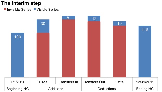
Before diving into how to utilize waterfall charts, it’s crucial to grasp their basic principles. A waterfall chart, also known as a flying bricks chart or a bridge chart, provides a visual representation of sequential changes in data.
This style of data visualization is particularly potent for understanding how an initial value is increased and decreased by a series of intermediate values. These intermediate values can be periods such as months or quarters, or they could represent different elements of a business, such as departmental expenditure.
Waterfall charts are commonly used in financial analysis and business scenarios to show how a particular value has been influenced over time or by various factors. This makes the waterfall chart a vital tool in the toolset of data scientists, financial analysts, and business professionals alike.
The Power of Data Visualization With Waterfall Charts
Waterfall charts highlight the cumulative effect of successive positive and negative quantities, making it easier to interpret complex data. They serve to visually clarify complex data, making it immediately understandable and actionable.
Another advantage of using waterfall charts is that they give a clearer picture of the sources and uses of cash. This unique feature makes them an excellent tool for financial analysis and reporting.
The visual representation of data in a waterfall chart also enhances the ability to make quick and accurate decisions. This can be critical in fast-paced industries where understanding financial influence or impact over time is crucial.
Using waterfall charts effectively can steer you toward the path of informed decision-making and strategic planning; essentially providing the key to unlocking your business potential.
Building your First Waterfall Chart: Essential Steps
Alt text: A man studying waterfall charts on his computer
Creating a waterfall chart might seem complicated at first, but with a few simple steps, it can be relievingly straightforward. The initial step involves identifying and gathering your data, ensuring it is accurate and up to date.
Next, categorize your data according to its roles in the chart: initial values, intermediate values, and the final total. The initial value is the starting point, the intermediate values make up the various increases and decreases, and the last value will be the final total.
With your data categorized and ready, you can input it into your charting platform. Today, many platforms such as Microsoft Excel and Google Sheets can automatically generate waterfall charts.
In your selected platform, you will then be able to finalize your chart, adjusting colors, labels, and size to ensure it visually represents the information effectively and appealingly.
Practical Application of Waterfall Charts in Business
Waterfall charts can be seen in various business scenarios, including financial analysis, inventory management, and performance tracking. For financial analysis, these charts can illustrate the progressive changes in the cash balance of a company over a period.
Similarly, in inventory management, waterfall charts can visualize the flow of goods, showing how opening stock is affected by various factors like purchases, sales, and losses, to result in the closing inventory.
Performance tracking is another area where waterfall charts shine. Whether tracking the performance of a single sales representative, a department, or an entire business, these charts can visually represent the changes over time.
When applied correctly, such applications of waterfall charts can change the course of businesses and lead to improvements in diverse sectors.
Altogether, the usage of waterfall charts in data visualization offers a comprehensive view of complex data. By understanding the basics, leveraging their potential, learning to create them, seeing their practical applications, and mastering advanced techniques, you can truly harness the power of waterfall charts.