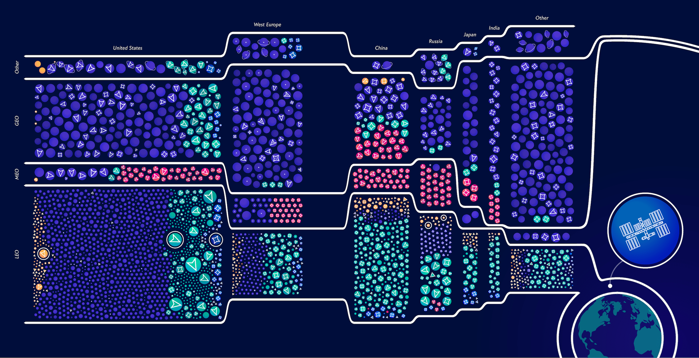
In this era of information, data is a powerful tool that many businesses and organizations harness to drive engagement and improve user experiences on their websites. However, presenting that data clearly and engagingly can be a challenge. That’s where data visualization, specifically using treemap charts, comes in. Below, we will explore how the treemap chart can enhance website user experience and drive engagement.
The Intersection of User Experience and Data Visualization: A Brief Overview
Alt text: A treemap chart against a black background with multi-colored data next to an image of a tree.
User experience (UX) and data visualization are two intertwined fields. After all, the purpose of data visualization is not only to represent large amounts of information in a manner that is easy to understand but also to provide a satisfactory user experience.
As such, data needs to be displayed in a manner that is intuitive for users, regardless of their technical know-how or familiarity with the data. Improper visualization of data can lead to misinterpretation and lower user engagement.
On the other hand, when users are suitably engaged and find the data presented to them in an easy-to-understand format, it leads to higher user satisfaction and even conversions. And this is where treemap charts come in.
As a unique data visualization tool, a treemap chart offers a grid-like structure that can effectively represent hierarchical data. It can illustrate distribution, proportion, and even correlation in a visually appealing and intuitively comprehensible format.
Unraveling the Potential of Treemap Charts for Enhancing Website User Experience
Treemap charts provide a wealth of potential for enhancing website user experience. First, they allow complex information to be presented visually rather than in a text-heavy format. This makes it easier for users to absorb, interpret, and engage with the data.
Moreover, with its ability to show hierarchy and proportion, a treemap chart can provide insights into data that other visualizations might not be able to. This can go a long way in keeping the user engaged and compelling them to further interact with the data.
Another advantage is the personalization and customization capabilities that come with treemap charts. Changing a treemap’s color coding, size, and other design elements can drastically affect how the user perceives and interacts with the data.
How Treemap Charts Transform Complex Data Into Comprehensive Visual Formats
One of the ways in which treemap charts enhance website user experience is by transforming complex data into comprehensive visual formats. They eliminate the need for users to sift through dense data tables or interpret complex algorithms.
Instead, treemap charts utilize spatial area and color hues to represent different dimensions of the data. This allows users to quickly comprehend the data and pick out key patterns and trends.
Even large volumes of data can be fit into a treemap chart. Each rectangle in the chart can represent a data point, which is nested within larger rectangles to show the structure of the data. The size and color of the rectangles reflect different measurements, adding multiple layers to the data visualization.
Strategies To Implement Treemap Charts for Improved Website User Engagement
Alt text: An example of a treemap chart on a computer screen showing multiple data in different color boxes.
When implementing treemap charts on a website, a few strategies can be used to maximize user engagement. Firstly, the treemap should be designed to align with the website’s overall aesthetic. This affects the website’s visual appeal and the user’s ability to interpret the data.
Secondly, the chart should be intuitive and user-friendly. Users should be able to easily navigate and understand the chart without needing extensive instructions or background knowledge.
Thirdly, the data should be presented in a meaningful way. The size and color of the boxes in the treemap chart should correlate accurately with the data they represent. This not only enhances accuracy but also aids in data interpretation.
Effectively presenting data visually pleasing, easy to understand, and engagingly is the key to improving user experience on a website.


